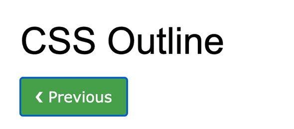
Why setting the focus outline: 0 on a button is bad
December 12, 2020 • 1 min read
I’ve learned this thanks to the fact that I’ve shared learning about outline: 0. I was quite annoyed by the blue ring around my buttons whenever they were clicked but didn’t spend much time looking into it. I’m not a designer so I let it go easily.
While working on some tutorials I discovered the outline: 0 option and was excited to share it. The moment I did luckily Germinal, Lead Instructor at CodeOp, made me aware of what a big mistake doing this is. Removing that blue border that tells you that you’ve clicked on something, that you obviously know you’ve just clicked on, has consequences for those who won’t browse your site by simply clicking on buttons. Even though I did a course on web accessibility and I am trying to be very mindful about it, sometimes I happens that I make mistakes and I am open to correct them.
Not everyone is browsing the web like I do. Some rely on their keyboard. Therefore by removing that outline when a users hits the tab key they cannot really see/know if the button is selected or not. This is not fair and there are some easy ways to fix it.
My approach was to add a focus ring that has a brighter nuance (hue) of the background color of the button. Alternatively you could change the background color on click.
Here’s a demo of what I did:
See the Pen Buttons example by Stefi Rosca (@stefi23) on CodePen.
I’ve used added box-shadow to the focus.
.btn-blue:focus {
  outline: 0;
  box-shadow: 0 0 0 3px #91cbed;
  border-radius: 2px;
}
There are different alternatives to this for which you’d use Javascript. I recommend checking these:
- One from David Gilbertson
- Another one from Alice Boxhall
Hope this was useful.
I’ll leave you with another discussion around graying out or not disabled buttons
If you think this was useful let me know.
Thank you!
Read More:
Stefi Rosca
👩💻 Frontend Developer, 🌍 traveler and⛷️ Skier
Recurse Center Alumn

